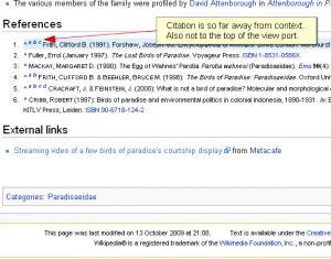
I don’t know about you, but I often find myself checking Wikipedia citations and notes either to read more on a subject or to simply check the authority of a source. I do this while reading and not after I’m done reading the article. This process involves clicking on those tiny bracketed citation numbers which plummet the viewport down to the references or footnotes section, highlighting the citation content and often bringing it to the top of the viewport. I say often and not always because the area beneath the desired citation may not be long enough to fully scroll the citation to the top of the viewport. As a result, you end up depending on the highlighting mechanism and/or the numbering to locate the citation.
Assuming the user wishes to check sources while reading an article, this method of locating citations within a Wikipedia article poses a couple of inconveniences:
- Disrupting the user's flow: by shifting the screen downwards and suddenly to the references or footnotes section, the equivalent of navigating to a second page occurs and the user's focus is interrupted. Returning back to where the user left off requires clicking the back button or a tiny arrow preceding the citation content, or manually navigating back using the scrollbar.
- Inconsistent placement of citation content: the desired default behavior of a page anchor is to bring a linked section of a page to the top of a viewport, but this could only happen if there is a sufficient area beneath the linked section to scroll it to the top of the viewport. As a result, the targeted citation content ends up positioned dependent on the length of the area beneath it, giving way to a slightly inconsistent user experience.
Suggested improvement
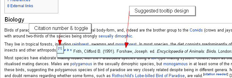
Instead of us heading down to the references or footnotes section, it should come up to us! I’m not saying that the footnotes or references sections should be eliminated in favor of in-page citations– no, they’re quite useful and, not to mention, required from any self-respecting research article. My solution simply introduces a tooltip, which contains the citation content and any associated links (which could be background-tabbed at the user’s leisure). This tooltip could be easily toggled on or off by clicking on any citation number or note-link in an article. This eliminates the need to travel downward in any given Wikipedia page and provides for a more efficient Wikipedia experience. Here’s an example of how this might look like:
Shown in the diagram is an example of what could happen when a user clicks on a citation number. In the example above, the user clicked on the first citation which brought up a tooltip containing the citation information and an assortment of relevant links. This way the user’s flow of reading isn’t disrupted and they may open any linked sources in new tabs and quickly return back to reading the article by clicking on the toggle again to hide the tooltip.
This isn’t exactly a revolutionary idea, but I’m just throwing it around to whom it may concern. This is one area where introducing some Ajax could be considered a non-intrusive enhancement and it could be made to, easily, degrade gracefully (not that this matters much anymore) by defaulting to the current behavior.


